hey guys, i been testing tiledesk extensively lately, and one area that needs a revamp is the chat window.
- we have multi-chat source, but that doesn’t show in the chat main lists (there should be an icon or something to identify the source)
- we have chat tags, but that doesn’t show up too (it would show up there too)
- assigned and unassigned chats cannot be identified from the chat main window
the guys over chatwoot done these and it looks fantastic
looking forward to your comments
Hi
we are releasing a totally rewritten version of the agent chat webapp this month with a lot of new features and improved performance.
Regarding your points:
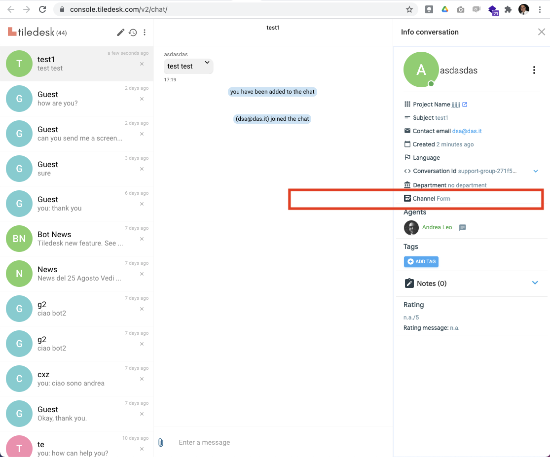
- we support multi channels (ex. whatsapp, twitter, email, ticket). You can find the channel here:
- we support chat tags in the chat here:
- the conversations you find in the agent chat are all assigned chats. You can see the unassigned conversation from the agent console (dashboard). With the next release you will see also the unassigned chats directly from the agent chat.
that is indeede awesome :D, but take care about the chats column it self
as more information needs to be shown in the individual chat horizontal tab (tags, source), and in the header you should be able to filter them (by tag, source, status)
Thanks.
With the next releases of the agent chat (ionic) we will improve the search features.
Regarding the competitor you show in the picture I can tell you that when you click on the left side (labels, inboxes) you cannot filter the chats but you go to the administration panel of the same.
i know this but i only used it as a sample, take this one for example
thats how the same interface above shows on mobile which means it can work as a mobile client as well
You can also use the Tiledesk Mobile apps (iOS and Android) as described here: Mobile Live Chat - Tiledesk